2.3 使用 ggplot2 可视化数据
什么是 ggplot2?
ggplot2 是 R 语言中用于绘制美观且灵活图表的包。通过 ggplot2,您可以绘制各种类型的图表(如散点图、直方图、箱线图等)。在生命科学中,ggplot2 常用于可视化 RNA-seq 分析的结果。通过可视化基因表达量数据,可以更好地理解基因的表达模式。由于 ggplot2 能够轻松绘制出美观且灵活的图表,许多人认为这是使用 R 语言的一大乐趣。
ggplot2 的基本语法
在这部分,我们将介绍如何使用 ggplot2 绘制条形图以展示基因表达量。首先,需要安装并加载 ggplot2 包。
install.packages("ggplot2")
library("ggplot2")
示例数据
我们将使用以下数据集。您可以在自己的样本中更改 Gene 和 Ratio 的内容。
gene_ratio <- data.frame(
  Gene = c("IL2", "IL4", "IL6", "IL8", "IL10", "TNF", "IFNG", "CD4", "CD8A", "CD19"),
  Ratio = c(2.34, 5.67, 12.34, 1.11, 3.31, 5.76, 9.11, 4.30, 6.76, 2.22)
)
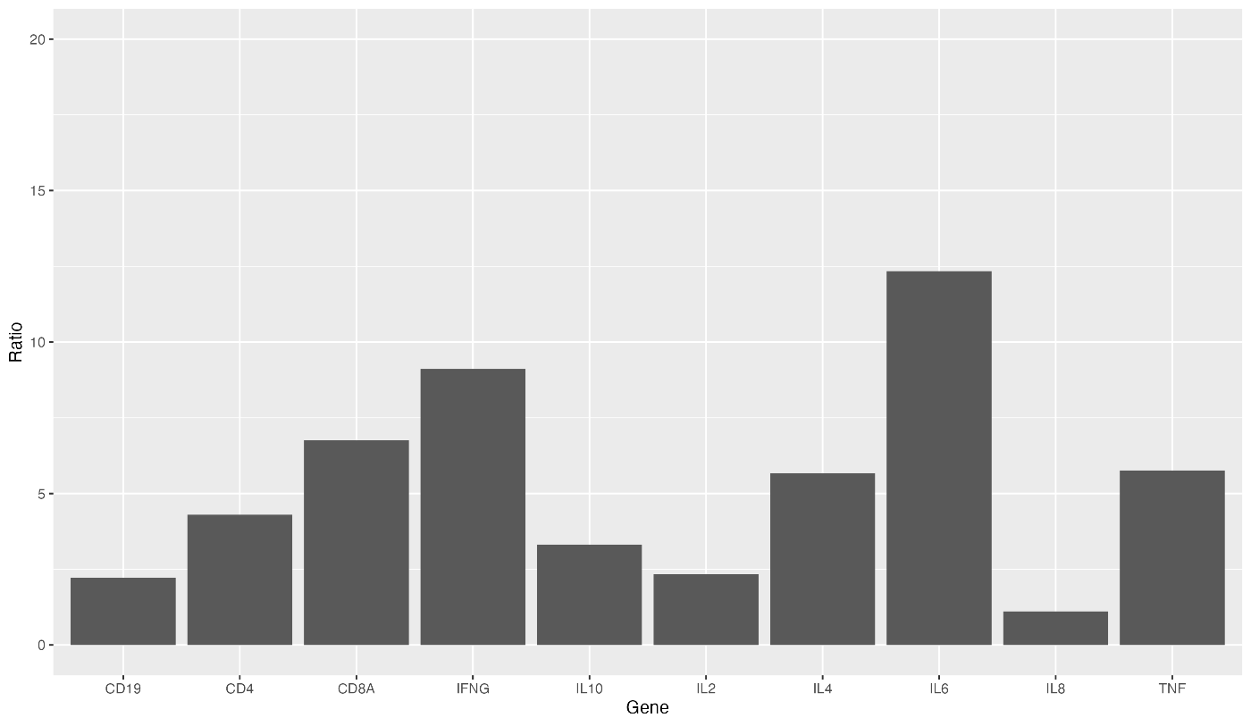
绘制基本条形图
使用 ggplot 函数创建一个基本的条形图。我们将数据传递给 ggplot 函数,并使用 aes 指定 x 轴和 y 轴的变量。然后,使用 geom_bar 函数绘制条形图。
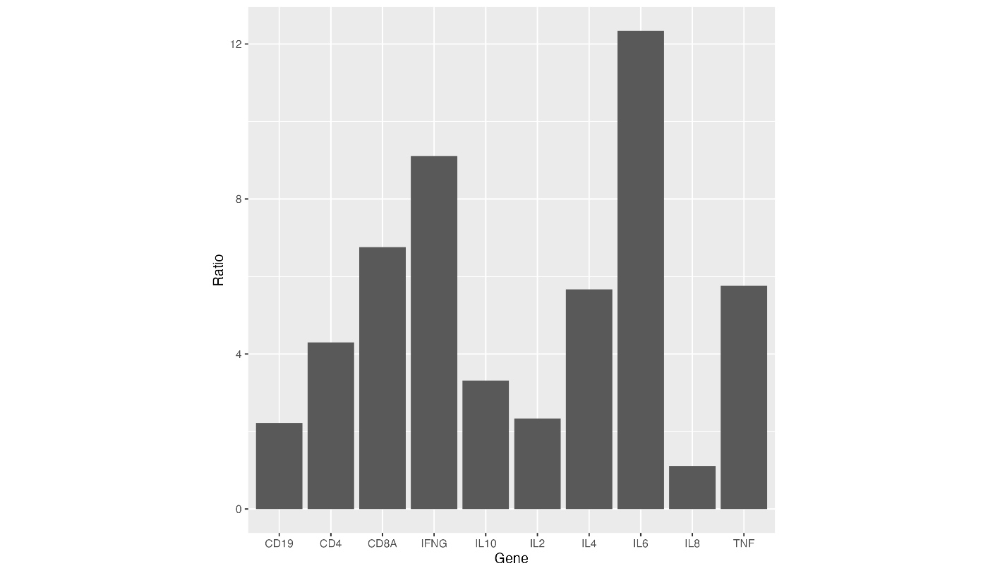
ggplot(data = gene_ratio, aes(x = Gene, y = Ratio)) +
  geom_bar(stat = "identity")
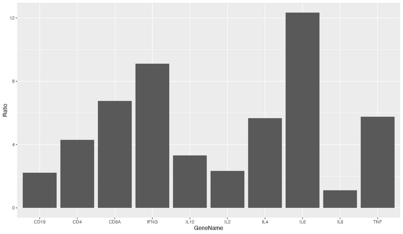
如果成功运行上述代码,您将看到类似于以下的条形图:

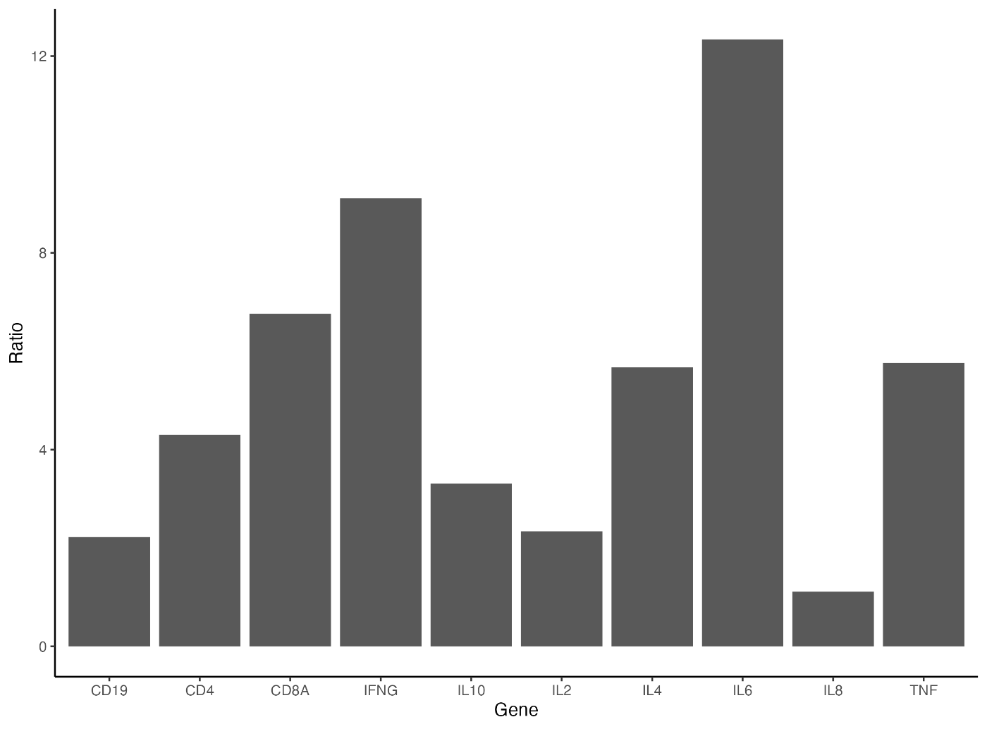
使用 gene_ratio 数据集,通过 aes 函数设置 x 轴为 Gene,y 轴为 Ratio。接着,使用 geom_bar 函数绘制条形图,并通过 stat="identity" 参数确保条形图的高度与 Ratio 的值一致。最后,通过 theme 函数将轴的字体大小设置为 15。
ggplot(data = gene_ratio, aes(x = Gene, y = Ratio)) +
  geom_bar(stat = "identity") +
  theme(axis.text = element_text(size = 15))
输出的图表中,轴的字体大小已经增大!

添加了 + theme(axis.text=element_text(size=15))。请注意不要忘记 +。
顺便提一下,如果将 axis.text 部分指定为 axis.text.x,可以仅增大 x 轴的字体。如果要增大 y 轴的字体,请指定 axis.text.y。
ggplot(data = gene_ratio, aes(x = Gene, y = Ratio)) +
  geom_bar(stat = "identity") +
  theme(axis.text.x = element_text(size = 15))

接下来,我们将增大标签的字体大小。添加 theme(axis.title=element_text(size=20))。
ggplot(data = gene_ratio, aes(x = Gene, y = Ratio)) +
  geom_bar(stat = "identity") +
  theme(axis.title = element_text(size = 20))
这样就将标签的字体大小调整为 20。
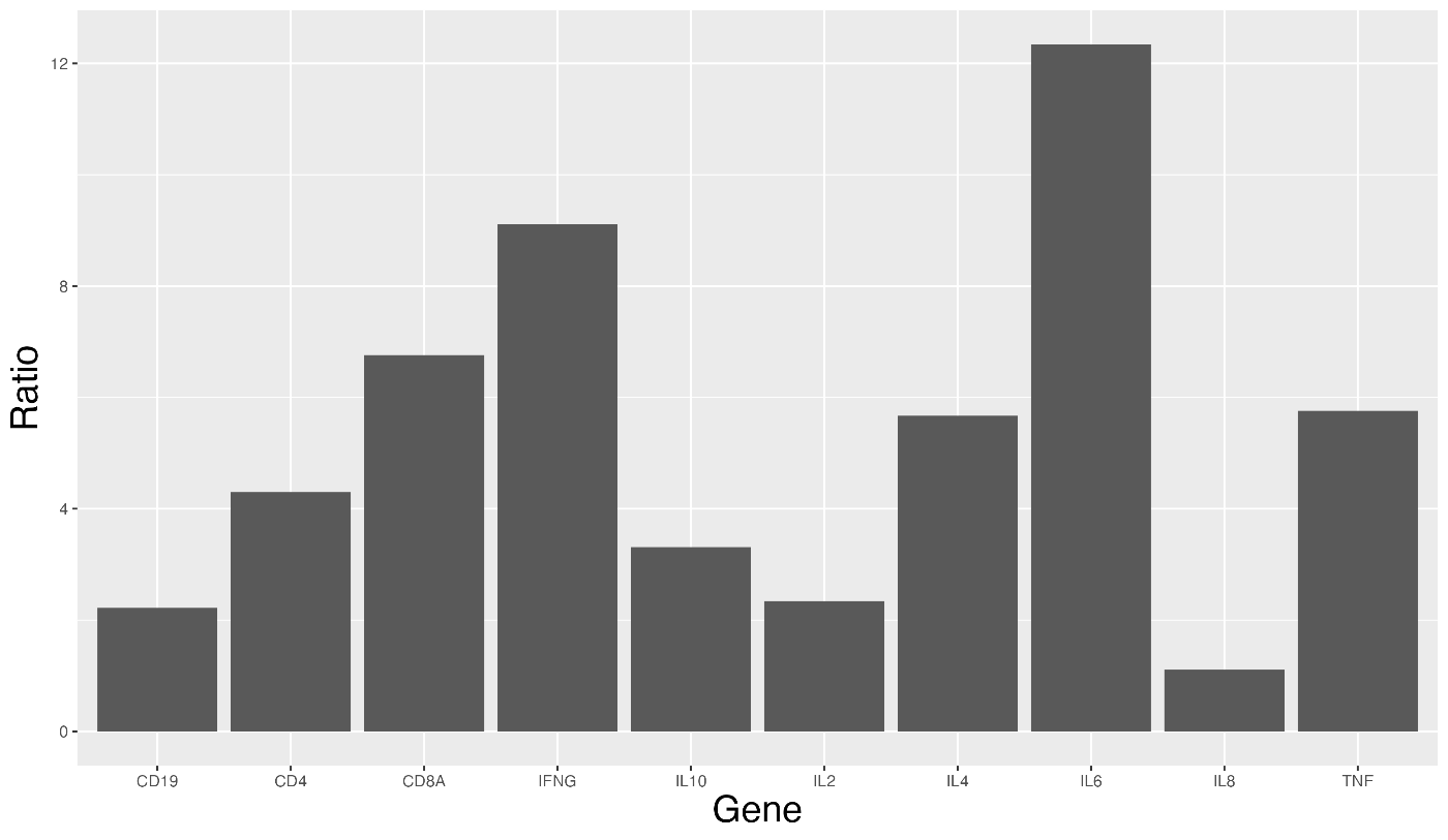
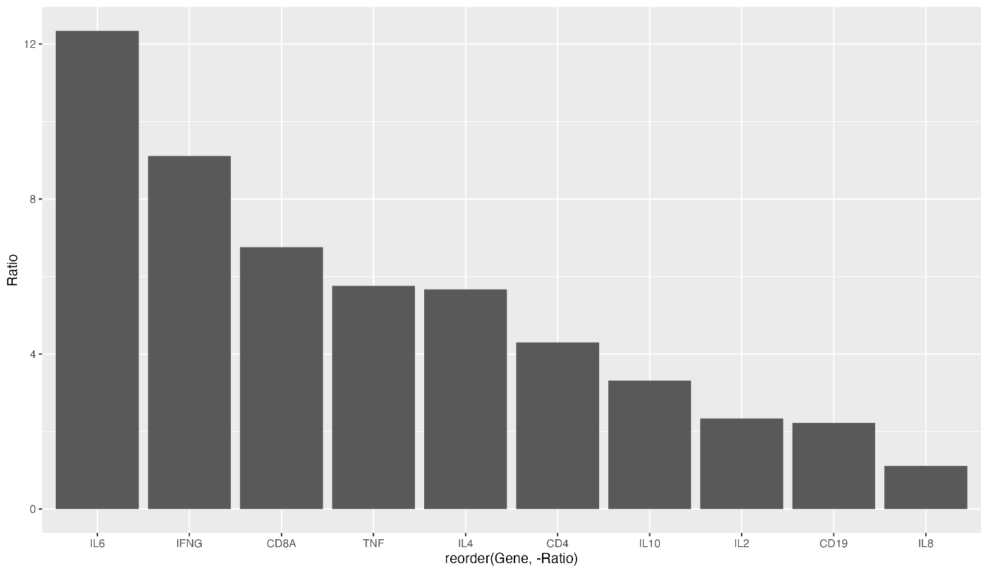
对于棒状图,可能需要按表达量排序。这种情况下,可以使用降序排序。以下代码可以实现这一点:
ggplot(data = gene_ratio, aes(x = reorder(Gene, -Ratio), y = Ratio)) +
  geom_bar(stat = "identity")
这样就可以从左到右按降序排序。
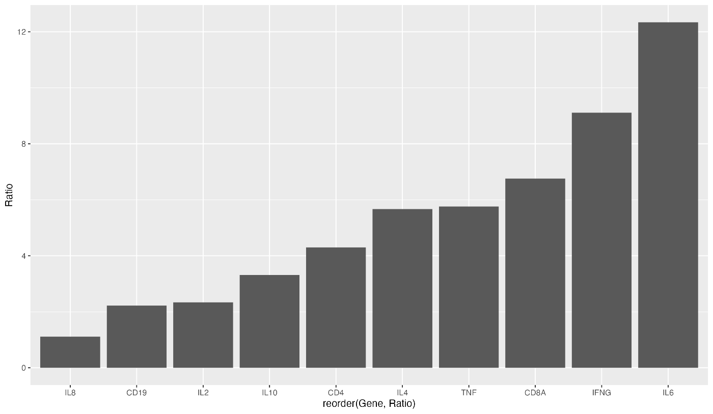
相反,要按升序排序,代码如下。reorder(Gene, Ratio) 并删除 Ratio 的负数。
ggplot(data = gene_ratio, aes(x = reorder(Gene, Ratio), y = Ratio)) + geom_bar(stat = "identity")
GGPLOT2 会自动调整纵轴,但您可以将其设置为任何您设定的值。试试设置 ylim(0,20)。
ggplot(data = gene_ratio, aes(x = Gene, y = Ratio)) +
  geom_bar(stat = "identity") +
  ylim(0, 20)
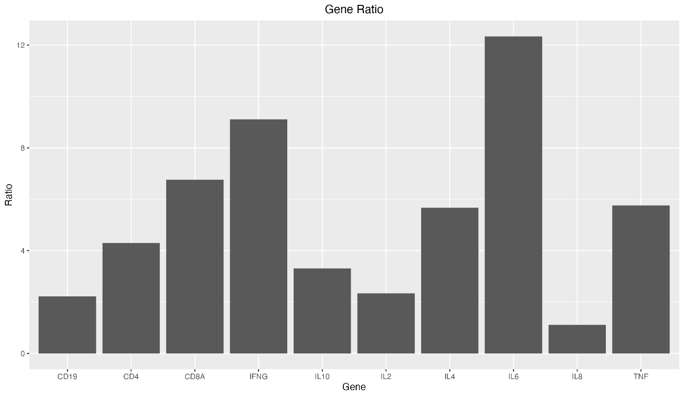
要给出图表标题,请指定 labs(title="Gene Ratio")。
ggplot(data = gene_ratio, aes(x = Gene, y = Ratio)) +
  geom_bar(stat = "identity") +
  labs(title = "Gene Ratio")

如果要将图表标题置于中心位置,请使用 theme(plot.title = element_text(hjust = 0.5))。
ggplot(data = gene_ratio, aes(x = Gene, y = Ratio)) +
  geom_bar(stat = "identity") +
  labs(title = "Gene Ratio") +
  theme(plot.title = element_text(hjust = 0.5))
有时,您可能希望将标签名称更改为任意值。 您可以通过指定 xlab("GeneName")来更改。
ggplot(data = gene_ratio, aes(x = Gene, y = Ratio)) +
  geom_bar(stat = "identity") +
  xlab("GeneName")
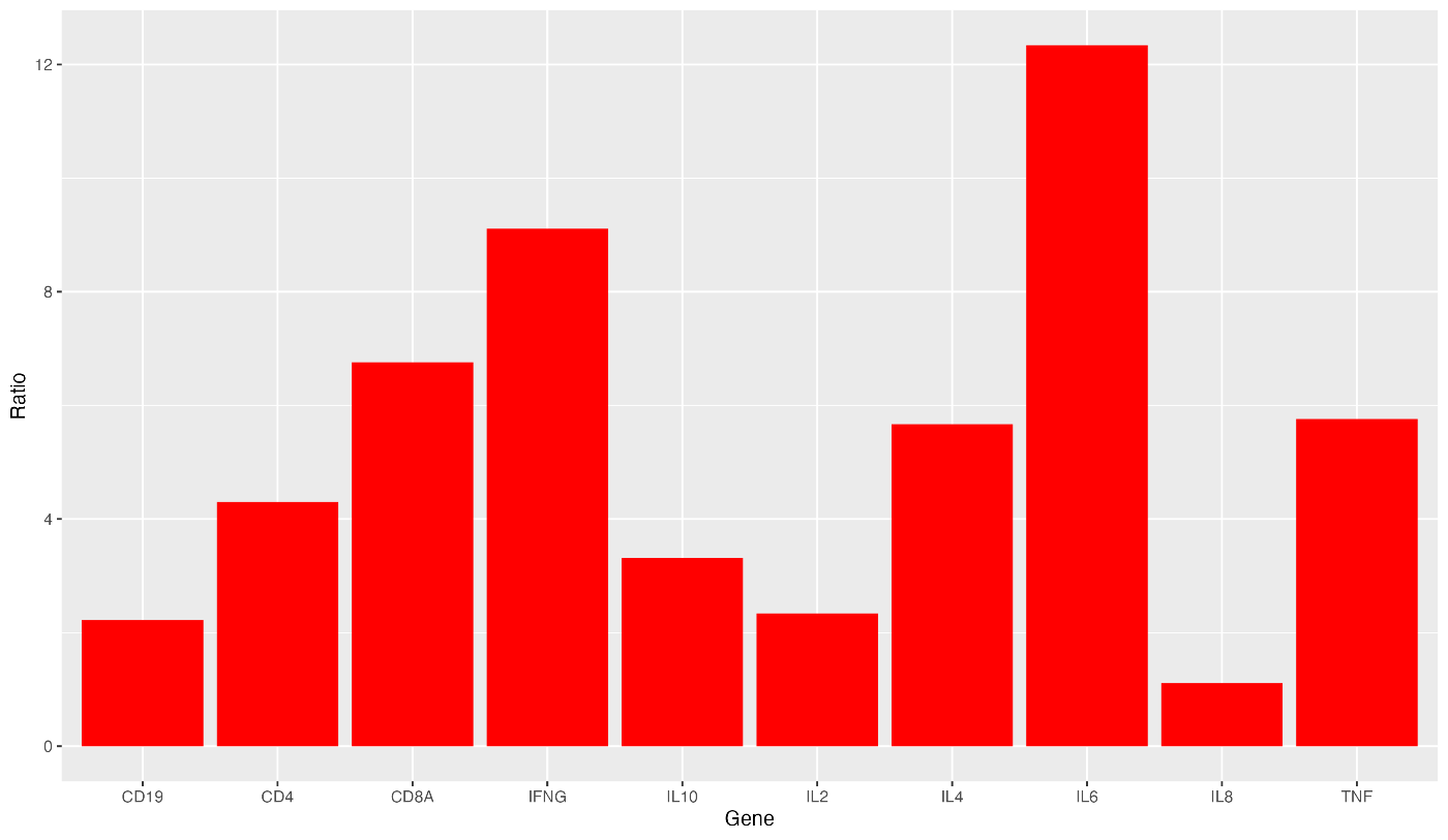
接下来,我们来改变条形图的颜色。 用 fill 参数指定一种颜色,例如 fill = "red"。
ggplot(data = gene_ratio, aes(x = Gene, y = Ratio)) +
  geom_bar(stat = "identity", fill = "red")
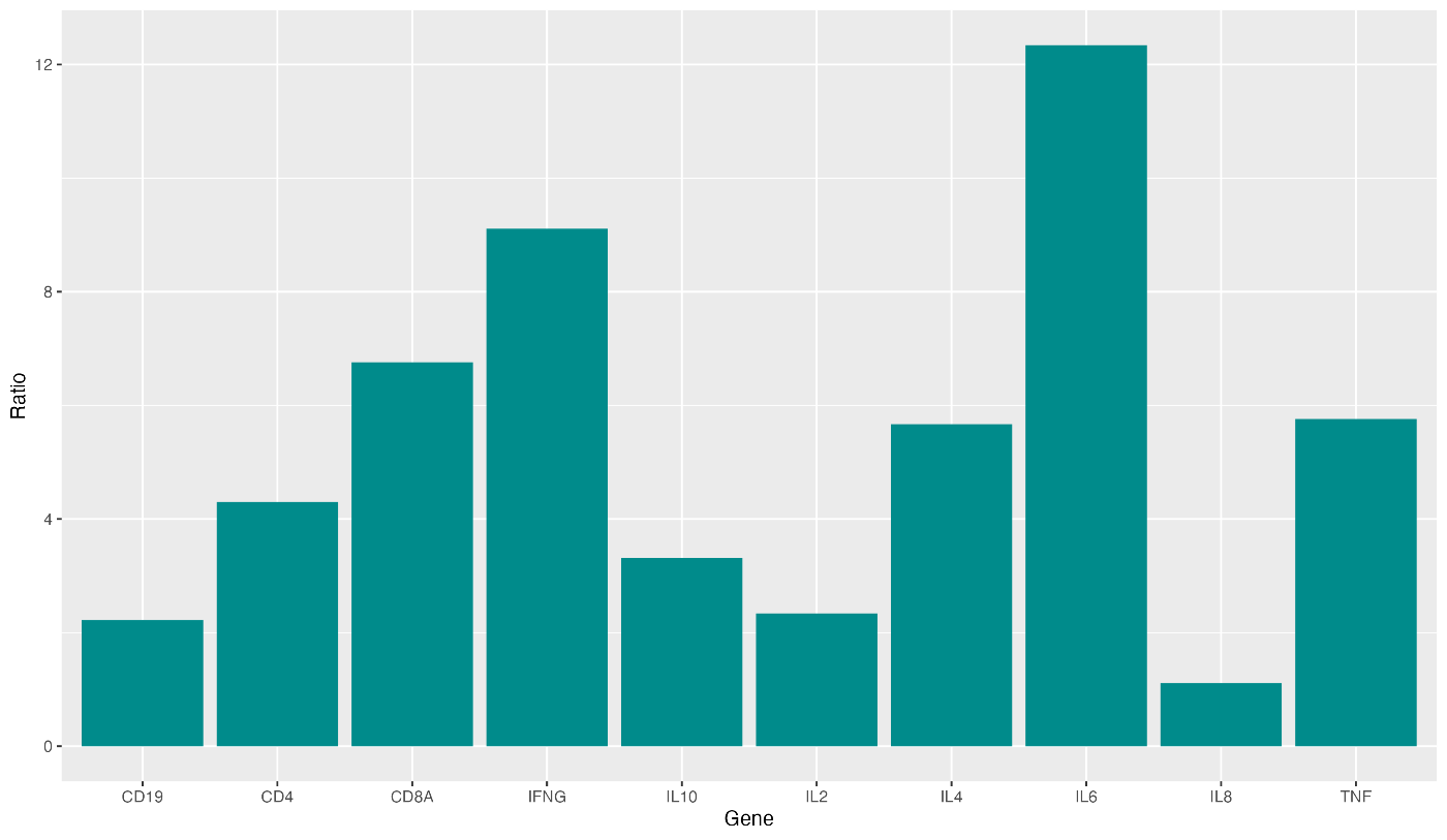
顺便提一下,您刚刚设置了 fill="red",但您可以指定颜色代码本身。您可以在 here 中找到颜色代码,请查看。
ggplot(data = gene_ratio, aes(x = Gene, y = Ratio)) +
  geom_bar(stat = "identity", fill = "#008b8b")
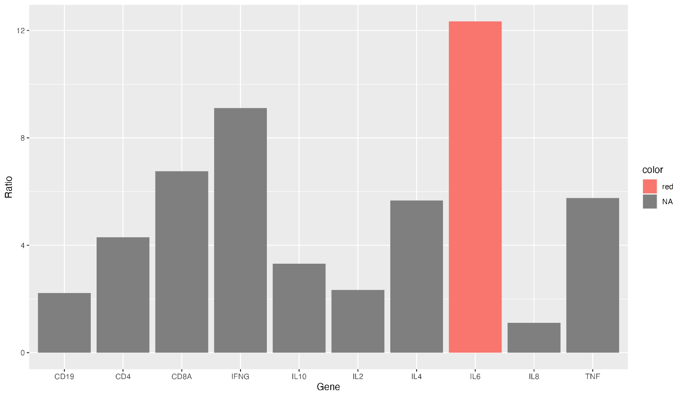
也可以只更改特定条形图的颜色。在这种情况下,请编写以下代码。
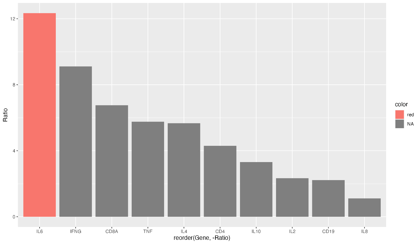
gene_ratio$color[gene_ratio$Gene == "IL6"] <- "red"

ggplot(data = gene_ratio, aes(x = Gene, y = Ratio, fill = color)) +
  geom_bar(stat = "identity")
只有 IL-6 的颜色可以改变。如果将表达量最高的条形图染成这种颜色,会更容易看清图表。
结合按降序排序的代码,就有可能说明表达量最高的基因。
gene_ratio$color[gene_ratio$Gene == "IL6"] <- "red"

ggplot(data = gene_ratio, aes(x = reorder(Gene, -Ratio), y = Ratio, fill = color)) +
  geom_bar(stat = "identity")
ggplot 允许您通过指定 theme(aspect.ratio = 1) 来改变纵横比。
ggplot(data = gene_ratio, aes(x = Gene, y = Ratio)) +
  geom_bar(stat = "identity") +
  theme(aspect.ratio = 1)
要避免在白色背景的 x 轴和 y 轴上出现辅助线,请指定 "theme_classic"。
ggplot(data = gene_ratio, aes(x = Gene, y = Ratio)) +
  geom_bar(stat = "identity") +
  theme_classic()
如果要进一步封闭绘图区域的外部边界,请按如下方式指定 panel.border。
ggplot(data = gene_ratio, aes(x = Gene, y = Ratio)) +
  geom_bar(stat = "identity") +
  theme_classic() +
  theme(panel.border = element_rect(color = "black", fill = NA))

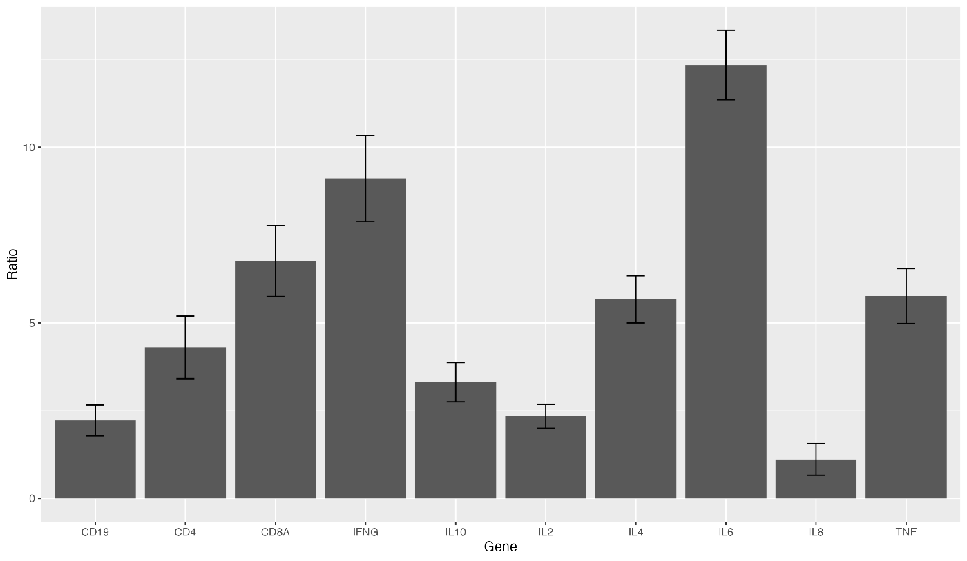
接下来,让我们为柱形图添加误差条。在 gene_ratio 中添加误差条的标准差 SD。然后在代码中添加 geom_errorbar(aes(ymin = Ratio - SD, ymax = Ratio + SD), width = 0.2)。
gene_ratio <- data.frame(
  Gene = c("IL2", "IL4", "IL6", "IL8", "IL10", "TNF", "IFNG", "CD4", "CD8A", "CD19"),
  Ratio = c(2.34, 5.67, 12.34, 1.11, 3.31, 5.76, 9.11, 4.30, 6.76, 2.22),
  SD = c(0.34, 0.67, 0.99, 0.45, 0.56, 0.78, 1.23, 0.89, 1.01, 0.44)
)

ggplot(data = gene_ratio, aes(x = Gene, y = Ratio)) +
  geom_bar(stat = "identity") +
  geom_errorbar(aes(ymin = Ratio - SD, ymax = Ratio + SD), width = 0.2)
最后一节介绍如何保存迄今为止输出的图表。使用 ggsave 功能可以将其保存为图像。指定要保存的文件名如下。
ggsave("sample.png")
保存图像时,可通过指定 dpi 调整图像质量。请注意纸张的分辨率,并指定适当的值!
ggsave("sample.png", dpi = 500)
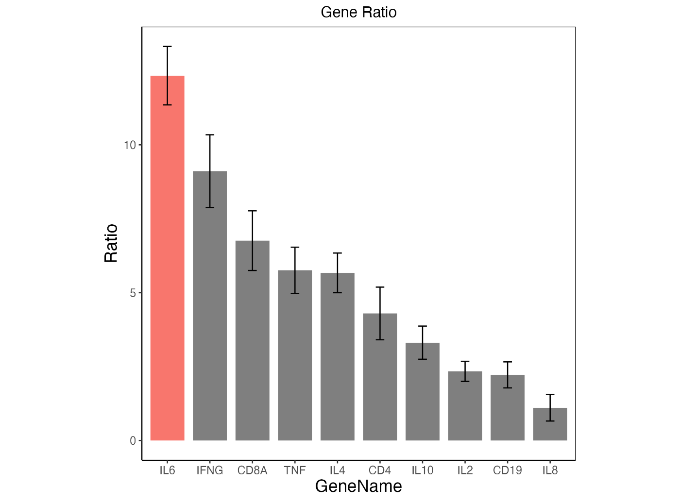
最后,我们将前面介绍的代码组合起来,创建了一个图表。
gene_ratio <- data.frame(
  Gene = c("IL2", "IL4", "IL6", "IL8", "IL10", "TNF", "IFNG", "CD4", "CD8A", "CD19"),
  Ratio = c(2.34, 5.67, 12.34, 1.11, 3.31, 5.76, 9.11, 4.30, 6.76, 2.22),
  SD = c(0.34, 0.67, 0.99, 0.45, 0.56, 0.78, 1.23, 0.89, 1.01, 0.44)
)

gene_ratio$color[gene_ratio$Gene == "IL6"] <- "f08080"

ggplot(data = gene_ratio, aes(x = reorder(Gene, -Ratio), y = Ratio, fill = color)) +
  geom_bar(stat = "identity", width = 0.8) +
  geom_errorbar(aes(ymin = Ratio - SD, ymax = Ratio + SD), width = 0.2) +
  xlab("GeneName") +
  labs(title = "Gene Ratio") +
  theme_classic() +
  theme(
    plot.title = element_text(hjust = 0.5),
    axis.text = element_text(size = 10),
    axis.title = element_text(size = 15),
    legend.position = "none",
    aspect.ratio = 1,
    panel.border = element_rect(color = "black", fill = NA)
  )

ggsave("sample.png", dpi = 500)
上述代码的输出图形如下所示。我认为现在的图表已经达到了可以在论文中发表的水平。